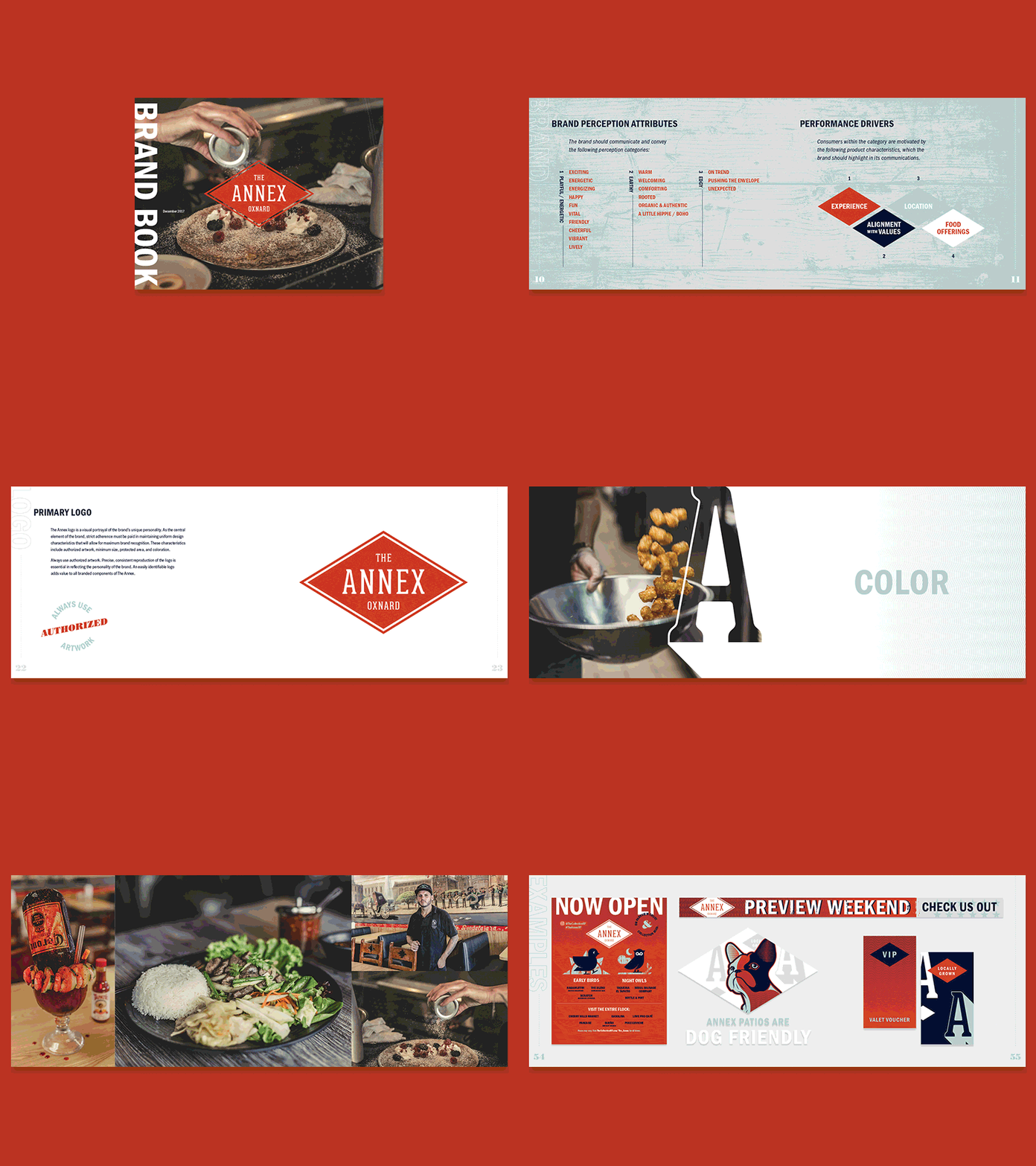
The Annex Brand Book
Over the past couple months, we've been working with The Annex on fully fleshing out and defining their brand and visual identity. They came to JIBE with an existing logo, which was, shall we say... unpolished. Fortunately, I was able to tweak and adjust it to a place that was more presentable and usable. From there, I built out additional brand elements, defining a color palette, patterns and textures, a handful of secondary marks, and all the accompanying accoutrement of a brand book.
From the brand discovery:
"The Annex is a small marketplace located within a larger shopping center in Ventura County, California. The marketplace serves as a melting pot for small eateries and shops, owned and managed by mom-and-pop proprietors. Each small business brings a unique flavor to the shared space, which combines bar-front eating with common-area seating. Their small spaces, along with their distinct cultures, blend together to form a unique environment and a distinct vibe. That vibe is creative and artistic, as demonstrated by the eclectic collection of distressed materials, natural textures, and recycled objects found throughout the space. With no pervasive or intentional theme, the vibe is funky and artistic, but entirely authentic. That authenticity ensures that the space feels creative and unique, but not silly or unnecessarily weird."
Authentic Eclectic Vibe Tenant Mix Playful/Energetic Earthy Edgy
I'll be sharing more in the future.
