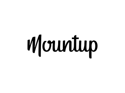
Mountup - lettering
Something I already shared, however, I didn't notice that I shared the wrong version, this one is the final version where the thickness of the bowl of the 'p' is consistent with the rest of the letterforms.
More by Lance View profile
Like

