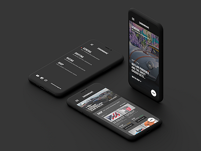
Hoonigan Mobile
Hoonigan Mobile concept
Mobile concepts for the other pages I did.
One thing I like (idk if it's confusing...) is the always present menu in the bottom right-hand corner. Gives the user access to quick actions like: Account, cart and the blog + other action items. But with the main nav being up-top taking you to other pages like: Racing, drifting, shop, etc ... I don't know if that would be confusing to the user – what do you think?
Let me know what you think and if you have any feedback, feel free to leave a comment below!
––
Follow me on Twitter @rynduffy
More by Ryan Duffy View profile
Like


