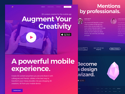
Website Design for 3D Sketching Platform with AR Functionality
We’ve got excellent news!
A sick website we’ve been working on for good friends of ours from San Fran is finally live! What you see above is the homepage we designed for uMake, who built a mobile platform for 3D sketching. The app offers robust design tools, cutting-edge AR integration for placing your creations in the “real” world, and dynamic content marketplace. Not to mention, a pretty big community of awesome 3D designers that are connected through the app. Nice.
Goals Guys from uMake believe that the future of content and 3D is mobile, inclusive, and increasingly immersive. So we were tasked to create a top-notch website that would introduce uMake’s innovative mobile application to the public, showcasing its main advantages and features and conveying the idea of its simplicity and usability. One of the requirements was having bold typography and vibrant colors, pretty much screaming at ya. But in a good way, you know. Not to mention - the content displayed on the website was created in the app and was provided by the client.
Approach We focused on presenting the app’s innovative nature by using vibrant colors and bold typography. One of the cool things about this company is that they actually provide you with courses that teach you the basics of using uMake and pretty much enable you to start sketching in 3D. Since the website is to be visited by several types of people, we created targeted pages that reflect the most important info about the product to the target group, focusing on what’s most important for each of them. The overall style was defined together with our client according to the moodboards we created.
Results We ended up with a visually rich, lively website that showcases all the main features and benefits of the mobile app. The website speaks to the target audience, getting across the idea of the application’s usability and providing a set of tutorials to help users take their creativity game to the next level. Not to mention, the development was done by our development team who did a great job of optimizing the performance. There are LOTS of heavy graphic content and it was a real challenge to make it all load smoothly without affecting the usability of the website too much. Thank you so much @Danil Goncharenko, and @Alena Chernitsyna for your hard work and making this happen! Special thanks to @Sofy Dubinska for her awesome illustrations, @Igor Pavlinski for cool 3D renders and @Tetiana Diakova for managing the entire process!
You can check out the live version here!
Would love to hear what you guys think!
Press "L" to show some love!
ᗈ Join our Newsletter! ᗈ Website ᗈ TheGrid ᗈ Spotify ᗈ Twitter ᗈ Medium ᗈ Facebook ᗈ Instagram

