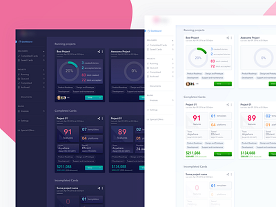
Dark and light theme of a project dashboard.
One of the project dashboards that I am working on has two faces, one in white and another one in dark.
It was good two days in exploring the matching colours with the hurdle of using brand colours.
The dark one is bit old but I hope you'll like it. Do give me your feedback and suggestions. 😁 ❤️
Also, You can also find/follow me here:
LinkedIn , Instagram ,
Medium, Twitter, UX.StackExchange
More by Sanchit Sharma View profile
Like

