Rubin
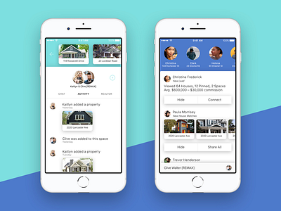
Some more screens from my Rubin project, which you can read about here: http://www.gregbeldam.com/rubin
There's two major sections of the app, one for Realtors to manage their clients and listings, and the other for clients to manage their house search. I wanted to be visually distinct between the two, so chose to have complimentary but slightly contrasting colours to represent the different roles. This carried over into the chat bubbles and other accent colours as well. Where ever the Realtor is represented it will feature the dark blue, and likewise the teal for the client.
More by Greg Beldam View profile
Like

