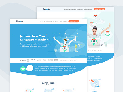
Landing page "Language Marathon"
Webdesign of a landing page for a language Marathon, the challenge is to take a class every day for three months and the student will get the money back. Looking forward to hearing your comments!!!, which of the 2 options do you like the most?
The client opted for the one with the real picture (white background) I like more the one with the illustration and blue background.
https://www.lingoda.com/en/language-marathon
More by Yadira Guzman View profile
Like


