The Art of the Brick
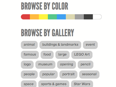
The most fun and challenging part of the brickartist.com redesign was redoing the gallery. This secondary nav was inspired by dribbble itself - hopefully that's not too obvious! But we just loved the idea of organizing the sculptures chromatically - more of a sight gag than anything - which was made possible by a custom WordPress taxonomy, which is something I never felt smart enough for.
More by Chloe Weil View profile
Like
