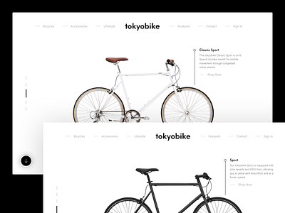
Tokyo Bike Website Redesign
I'm a huge fan of Tokyo Bike NYC and have purchased one of their bicycles myself. Here's a shot of the front page of their website redesigned.
Created using the 8pt grid system and mostly stuck with Material Web Guidelines yet not strictly as there are some creative elements throughout.
Take a look at the --> Real Pixels <--
As a part of a daily design exercise, I'll be uploading new redesigns and concepts daily through All Hands Design Studio.
–
Check out All Hands Design Studio.
We listen, define, adapt and grow digital products that thrive.
Press "L" to show us some love.
More by Andres Jasso View profile
Like


