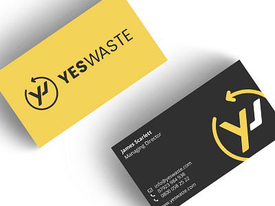
Yes Waste Branding Design
The bright colours and friendly typefaces chosen soften the brand to give the wide appeal to home and business users of the service. The logo icon is an anagram of the Y and W which has a familiarity to the shape of a skip, something the audience can identify with. The circle with the arrow was added as the on-demand service is prompt and the team are always on the move.
More by Sixth Story View profile
Like
