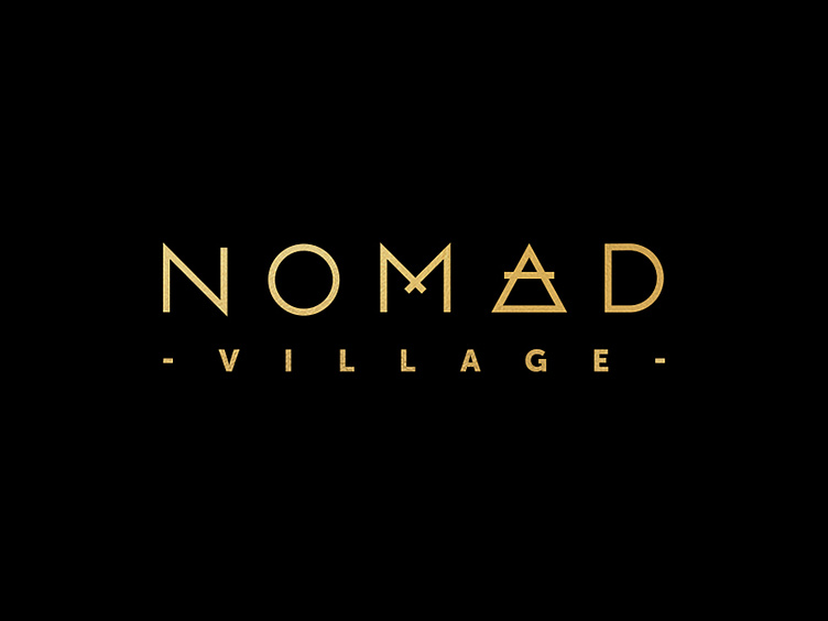
Nomad Logo 2
This logotype, inspired in part by sacred geometric forms, incorporates the alchemical symbol for the element “air” (replacing the letter “A,”) to symbolize the fact that a “nomad” is never tied down and has the ability to move freely and continously. The custom, angular typography simultaneously represents the unique architectural features of the Nomad Village housing structures.
More by Macaroni View profile
Like
