#ThirtyLogos challenge - Logo 2
Kicking off 2018 with the #thirtylogos challenge. Planning one a day and spending no more than two hours on at least three concepts.
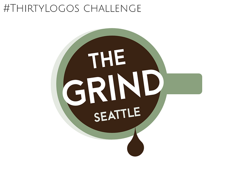
Logo 2 Client words: A small coffee shop chain located in Seattle, WA. The Grind prides itself on natural and local ingredients. For our new logo, we actually do not want to use any browns! Maybe oranges, green, other earth tones, etc. could work well. This logo will primarily be used as our store sign, on menus, and on coffee cups and merchandise.
My thoughts: I think I could convince them off the need for the dark brown “coffee” center. If not, that could be revised to black. I would alter the "Seattle" for any specific shop location - allows you to expand your merchandising collectability.