BespokeMail V2
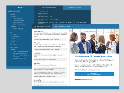
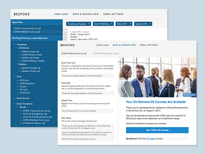
An update to the look of the app. The blue is over the top but you can change it or I'll tame it. Right now for initial production I'm going to run with this color.
Got rid of the unnecessary title header area and concentrating on keeping it streamlined. Kept only the most necessary in the code area and moved all the options to the bottom. The design just got more space by moving everything up.
More by Tori Pugh View profile
Like


