Visual Exploration
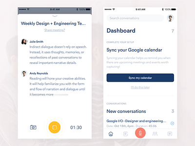
Here's an unused visual exploration of some UI from a project @Samuel Medvedowsky and I have been hard at work on for the last few months. This was a more muted, pastel coloured approach that was to include illustrations as part of the overall visual language of the product. Interestingly, during a user testing poll, this concept was most frequently described using the word professional - so professionals must like pastel colours!
