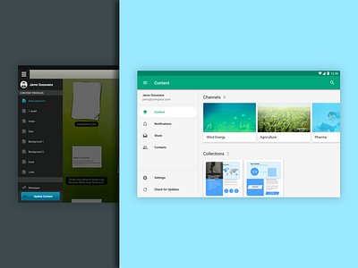
Showpad for Android: Homescreen Evolution
Left: Created in 2013, the MVP of Showpad's Android app directly mirrored the iPad app and it's iOS6-inspired UI.
Right: After joining Showpad in 2014, I was the sole designer on a major redesign of the Android app to bring it up to the new Material Design standards. In my three years at Showpad, I was the sole or primary designer for dozens of features for the Android app. While it's not Showpad's most commonly used app (6% of monthly active users), it's secretly my favorite out of the whole app suite, and I was very proud when it became a featured app in the Google Play for Work store in 2016.
Problem: The early versions of Showpad's iPad and Android apps had no homescreen or overview landing experience; instead, salespeople would land in whatever folder of content they had last visited. All navigation was under a hamburger menu. We saw very low engagement in all areas of the app, except for whatever the default landing folder was, and we heard anecdotally that users did not know there was more to do inside the Showpad app.
Solution: While iOS eventually moved to a tab bar style navigation, Material Design was still a strong advocate of the hamburger. To stay in line with that pattern but also make the navigation more prominent, I designed a collapsible navigation for tablets (most Showpad app traffic is from tablets, as it's a content presentation app). In its collapsed state, the menu hints at the other sections of the app via icons alone, but in its expanded state reveals corresponding text labels.
I also designed a homescreen experience that allows a user to open on an overview of all their content instead of in the middle of their content.


