The Hideout Logo
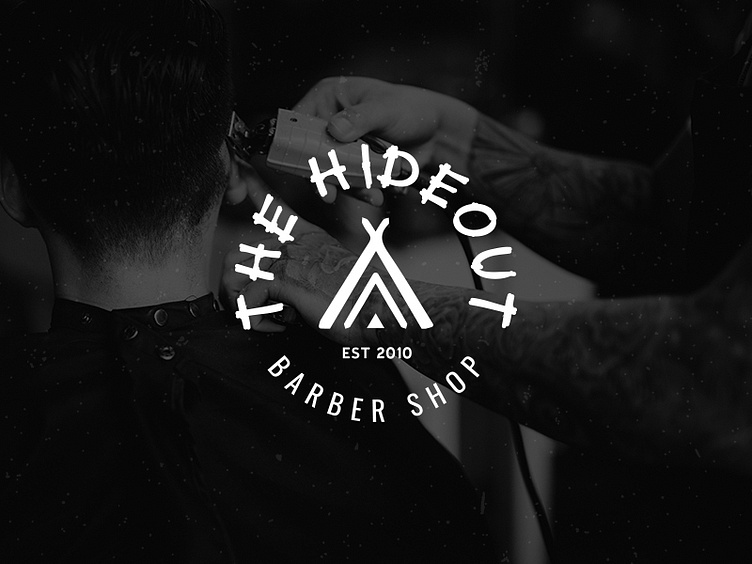
An initial logo concept for my local barber shop and friends (Mel & Nathan). The Hideout Barber Shop has been using a makeshift logo for far too long and decided it was finally time to build a brand that can grow and be rolled out across the business website and marketing material, not to mention some wicked ideas for shop front signage. They wanted a logo typeface that resembled a traditional campsite signage and a teepee logo mark to reflect the 'hideout'. The teepee was traditionally a place of warmth and comfort and Mel wants The Hideout to be just that, not to mention getting an awesome haircut at the same time.

