McGillivray Construction Brand Identity
General contractors tend to brand their company by using their own last name, merging their own identity with that of their business. With this in mind, I worked with Steve McGillivray to create a brand that he felt proud to put his name on. After a prior attempt at rebranding left the McGillivray brand looking generic and indistinguishable from other contractors in town, Steve was hesitant to try again so soon. But we made a plan to go back to what he loved most about his brand from the beginning.
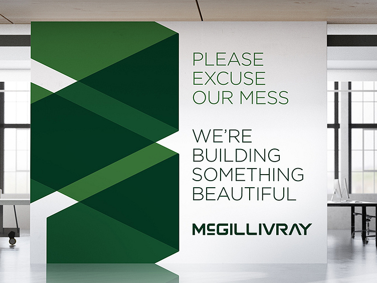
We kept his last name in its entirety and stylized it in a way that felt solid and substantial, but also modern. We chose to return to the all green natural color palette and expanded it to include darker shades for better contrast and visibility. The logo mark itself was designed to represent building blocks actively being stacked on top of one another, as if you’re watching the logo being built. This “corner stone” being formed by simple geometric shapes communicates a strong, well-built foundation which is the key to any successful construction project.
See more at carlyo.com