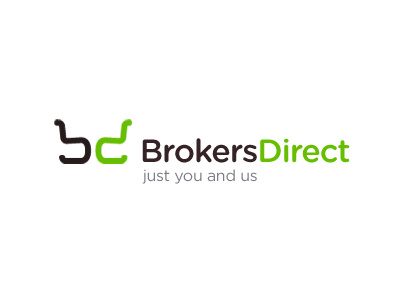
Brokers Direct Logo
First bash at a concept for an existing UK online insurance brokers. Needing a refresh to try and compete more with the big boys like Direct Line, Insure and Go, and MoreTh>n, they approached me to see if we could do something on the visual side.
Still playing with fonts, sizes, dimensions and such like, but gives you a good idea of the general direction.
Insurance is insurance, and it's not something that can really be glamourised too much. It's not something we like paying for, but we have to have it. Arrows seem to be pretty popular amongst insurance companies, so I wanted to really avoid that route. But finding another angle proved to be somewhat challenging.
BrokersDirect is a small company, but they want to appear a little bigger than they appear now. Their advantage is that they are very quick, you deal with one person and job done. No messing around, no comparing quotes. They also 'do' have very competitive rates, so are gunning to really take the fight to the mainstream.
The focus then was on the 'direct' but 'direct personal' approach, trying to bring in some human element, something that inspired that emotional connection to something that is usually pretty clinical and sterile. Companies like Churchills and Admiral are tackling this by humanizing the service.
But BrokersDirect is a pretty generic and sterile name, so not much to play with. After heaps of doodling and playing with initials, I realised the 'b' I was playing with looked looked like a chair. Then realised it could be flipped to make the 'd', thus creating this 'you and us' association. Two people, sitting down arranging insurance. So not only do we have the initials but we also have the exact sort of emotional connection that the client ideally wanted to convey, all without any arrows or stars. :)
I have chosen Gotham Rounded for this version as it implies friendliness whilst being stylish and clean.
