Yourday
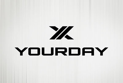
This is the logo we developed for YourDay: a personal transformation and leadership development program that utilizes a proprietary corporate athlete training system. They maximize power capacity through health and fitness, life balance, and personal empowerment.
Some of the thinking behind the mark:
• The icon displays an upright and upside-down Y to illustrate the
principles of balance through YourDay
• The italic Y in the icon symbolizes movement
• The icon is formed stylistically to align with athletics brands
• "YOURDAY" in all caps to denote strength and authority
• Typeface is curvilinear and clean to reenforce balance
and to appeal to a universal client base