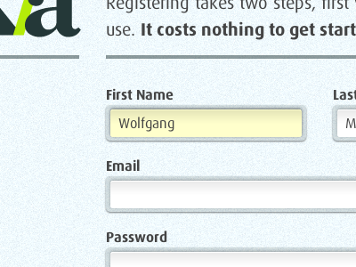
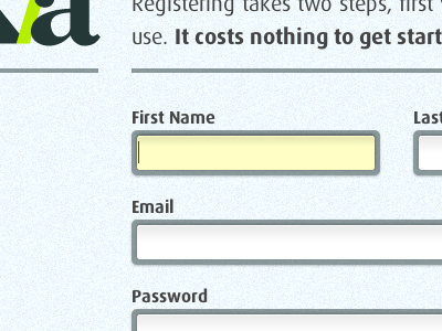
Sexier(?) Text Fields
Based on some excellent feedback from Rich Gustke, I've lightened up the border-color of the text fields, resolved an unmatched inner drop shadow, and I also tightened up the outer drop shadow. I'm much happier with the result.
Thanks for the great comments Rich, you're the first to give me some constructive feedback on Dribbble, and I loved it. I hope I can get more responses and opinions from designers as I move forward.
More by Conor Muirhead View profile
Like

