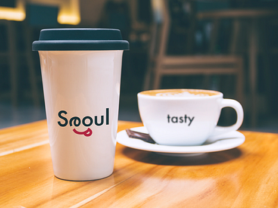
Tasty Seoul
Tasty Seoul
The first logo is 'Tasty Seoul'. Since Seoul is a perfect city to try out the delicious oriental Korean cuisine, I could not hlep but focus on the dining aspect. I used 'Futura' font and made 'e' resemble an eye, which makes this logo have a definite feature of a ludicrous experssion. The purpose was to relate a picture of someone eating something tasty. When the word 'tasty' is omitted in the logo, it is also possible to deliver an impression of Seoul as an enjoyable city. I believe this logo has several interpretations and therefore can be used in various situations.
More by Seonyu Kim View profile
Like
