MOBILE DESIGN TOOL (UX-BREAKDOWN)
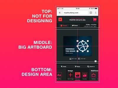
Here is a simple breakdown of an online poster design tool for mobile devices. There are three basic areas. The top section is for features that is not used often during the design process. By placing them at the top you have more room for design related features at the bottom, where it is easier for the thumb to reach. The middle section is as big as the artboard could be, without making everything to tight. I'd love to get some feedback :)