Rad Dad logo variant (v1)
Did you know that putting together a podcast isn't as simple as just recording an episode and putting it up on the web? The recording itself, in order to be good, is quite an intense process, but beyond that there are also all the supporting materials, like website, graphics, sound bites...etc. It's not a trivial effort.
When Rad Dad Show needed all of that, I decided to go minimal and do things fast, prioritizing speed of content delivery to the sex appeal of the supporting content. My thinking - the podcast needs to be good for people to listen, everything else, I can update as I go.
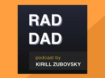
Here is a v1 of the logo, which is still more or less the logo. Would love to hear what you think should be removed/added to make it match the tone of the actual podcast. Thanks!