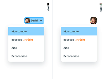
User Menu, Kitt : Ornikar Design System
Learners on Ornikar have their dedicated menu where they can manage their settings, buy more credits and access the Help section. They have all the control on their account from this menu.
Aside from that we're using our Main Navigation pattern which purpose is pure navigation through the sections of the product. That way we have two navigation patterns that are really distinct and serve 2 different kinds of content.
Nothing new here. The goal was not to create a new navigation paradigm, but to create a system that could evolve with the user through its customer lifetime on Ornikar — more on that in another shot — and be easy to understand.
You'll see more of Kitt, our design system, in the upcoming weeks. 🚘
🇫🇷 We're hiring designers in Paris!
👉 UI designer
Reach out to us at design at ornikar.com, no resume required. We're looking forward to talk to you.
