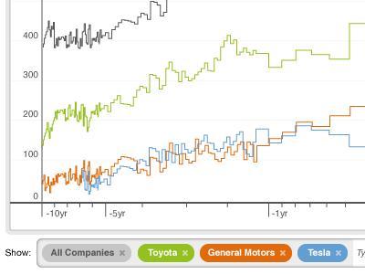
Data chart
The data table feeding this chart had too many entries to make the chart useful. The "show" box is both as a way to manage the data being charted and a legend for the chart.
The user can drag and drop a table row to the chart, or use type ahead search in the box to the right of the legend. The color of the box (green, say for Toyota) corresponds to the color of the line in the chart.
More by Andrew Liebchen View profile
Like
