Bodyhack (Logo)
Here is some work in progress logos for a client called 'Bodyhack'. They have asked me to see which you guys like the best.
A bit of info on Bodyhack; Bodyhack will revolutionise the way people get fit and healthy. Bodyhack provides people will real advice based on what's good for their individual constitution and goals, not bad generic advise that may not work for everyone, or at all. Fitness plans and diets are tailored to an individual and proven with photographic and metric evidence, almost like a gym combined with a science lab.
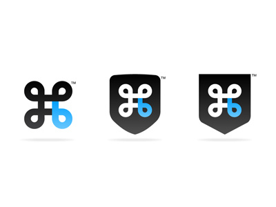
The concept here focusses on the symbol of St John's Arms, which was originally used to defend from bad spirits and bad luck, or in the context of Bodyhack; bad advice. It has also become popular in modern computing, which works well with the 'hack' theme.
One corner has been highlighted to present a letter 'b' which stand for 'body hack' and 'body', which makes this logo more own-able. There is further meaning here too; Bodyhack offers some comparison in their service, comparing which fitness plan works best, here there is a four-way comparison, with one (the blue one) being identified as the best.
The later two also include a shield, which represents the body, or more precisely, defence for the body, which again further's the logo's own-ability. It also gives a club feel, which emotes a sense of trust, important for the nature of the service Bodyhack provides.
As you can see, a lot of thought has gone into the imagery, but in general, the logo is cool and wearable on a t-shirt, shorts and various other apparel.
So, which do you guys like the look of most?
