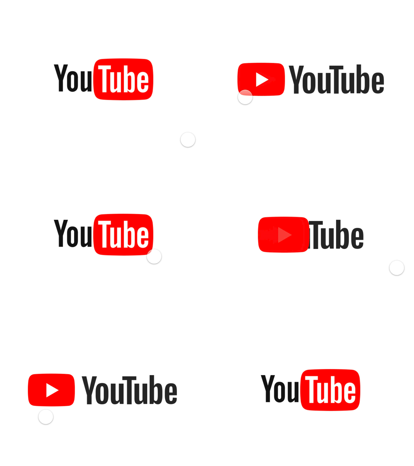
YouTube Logo
YouTube has changed its logo on this September and showed this animation:
→ https://goo.gl/images/nsZFia
I recreated this in @Framer so now you can play with it from your iPhone 6, 7, 8:
→ https://framer.cloud/iAXys/
This animation would be fairly easy to do if the old logo and a new one have the same style of the text, but they don't. That greatly increases the complexity of this task, because we now need to use three masks for the text (try to guess for what).
Here're 3 main tasks, that were needed to be completed in the preparation stage:
✅ Correctly resize logos to sync the new and an old one.
✅ Correctly align them with each other.
✅ Correctly organize the source file in Sketch and prepare the artboards for the further animation in Framer.
And here're 3 main tasks that I set myself when creating a clickable prototype in Framer:
🎯 The prototype should be intended for viewing on the iPhone 6/7/8 in portrait mode.
✅ The whole animation speed should be controlled by only 1 variable.
✅ The work of all three masks with the text must be perfectly synchronized so that the viewer doesn't even think about the fact that masks exist.
I really like the result, and what about you? Feedbacks are welcome.
Feel free to follow me on Twitter and Instagram.
Let's design something: anron.kai@gmail.com


