Lexicon Line Charts


Hello Dribbble!
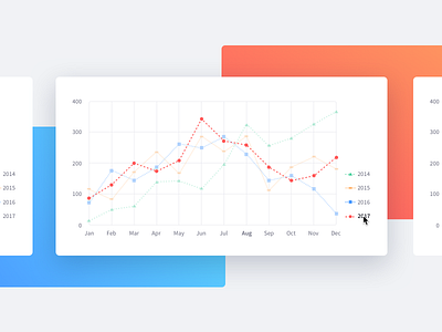
I'm so proud I can finally share with you some of the chart guidelines and features we've been working on at Liferay.
Our goal was to improve the line chart visual and accessibility using shapes and line-dashes before including the colors, this helps the user to identify faster the differences between the shown data.
In the attachment you can see the color list, a B&W example and the hover interaction to focus a specific data.
Thanks to the Infrastructure team of Liferay and Julien Castelain (https://github.com/julien) this features have been implemented in the open source project Billboard.js (https://naver.github.io/billboard.js/). Feel free to use it and collaborate!
You can see this and other Lexicon components here:
https://lexicondesign.io