Sparrow
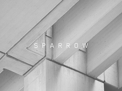
Sparrow is a new property development company based in London. They approached me to create their brand identity with the aim of differentiating them from their competitors. A sparrow is a very small and tiny bird and is sometimes a symbol of simplicity and community. The brand marque takes the form of a bird flying to capture the essence of the brand in a light and fresh manner. Modern typography, a sophisticated colour palette and clean print finishing combine to create a strong and accessible new identity.
