Site updates cont'd
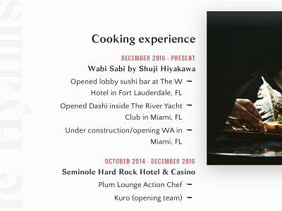
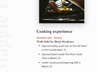
I had to re-think how I styled the lists when content shifts to the left of the image, and the text aligns to the right (based on viewport size). To solve this issue, I threw the knife blade (part of my sister's brand identity) to the right of each list item and flipped it on its X-axis.
I'm also using image source sets to swap out square and rectangular versions of each asset, again depending on your viewport size.
More by Kyle Hyams View profile
Like

