Feedback wanted
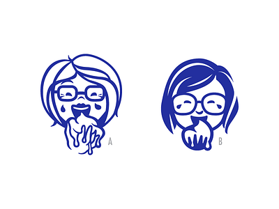
Hi guys, i'm working on this logo and I could really use some feedback. I started with the left one and I liked the energy and greediness she expresses. But after looking at it for a while I started to doubt if she is maybe to detailed for a logo. That's why I tried the right approach. It is more simplistic but also to decent. I want her to cry but also look happy and a bit greedy. Any thoughts on which approach works best and how I can improve what i'm trying to achieve?
More by MICS.BY.MISCH View profile
Like

