Bre Group Visual
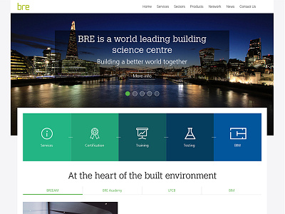
So its been a few months since we relaunched the company website and some of the feedback I received was that there was too much white space and the hero image was too big. I've struggled to convince them that white space improves readability and that the hero image is striking and with key messages will be impactful. This is a revised design, which needs further work, but utilises overlaps to give a sense of feeling smaller