s & ß
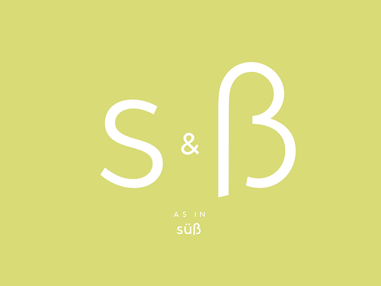
I spent so much time designing the “s”. It’s by far the most difficult character. Balancing the upper and lower part is hard work. The upper part should be a little smaller to look balanced.
And there’s also the beautiful sister: “ß”
Today’s door of the typography Advent calendar door reveals both of them. Are you taking care about the correct use of the “ß” as much as I do?