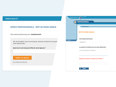
Government website interface - Daily UI #2
Hi,
I was browsing some government website while doing my paperwork and I've been disappointed by the usability of the page password lost.
That's why I've create a Before/After design of this page.
Here is what I've improved in my version :
- informations in the menu are easily recognizable (website title / help / leave) with more standard icon
- the non editable informations (like email & my question for recover password lost) are no more in a "input like" rectangle
- the input where the answer is required is closed to the label
- I've deleted the red color on the label, which mean "error or danger" for no reason
That's how with a little bit of design and good practice, we can keep the same content and improve usability of an interface.
Hope you enjoyed it and
tell me what you think about !


