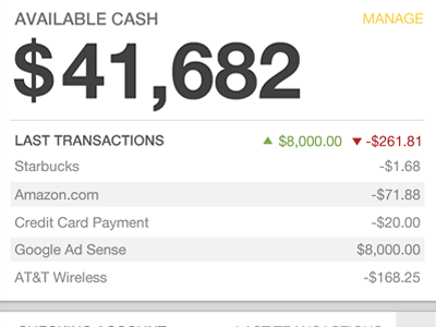
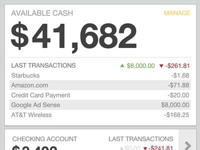
Account Dashboard (v2)
This is just a fix on the original account page I did, I spaced the transactions a bit more, darkened some of the headers and created a bit more contrast with it. Thanks for the input @Kerem.
Also realized that I moved the accounts figures down a bit too much so looks like they are a bit too low now. C'est la vie.
More by David Geere View profile
Like


