TravelBug
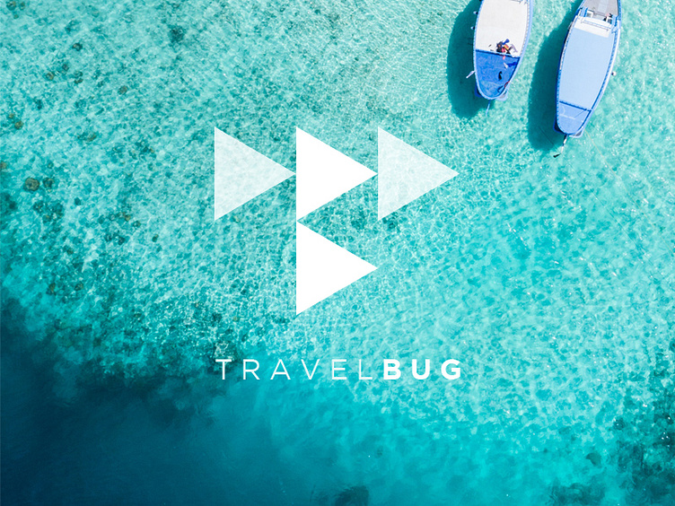
Logo we designed for an app we're currently working on called, "TravelBug". You'll notice that the mark doubles as a "T" and a "B". To make the distinction more obvious, we used regular white and an offset of white. The word "TravelBug" has 3 syllables hence the use of triangles (3 sides). Lastly, the positioning of the triangles coincides with the "play" symbol (ie. work hard, play hard) to have leisure and fun. To "go" (be on the move) discover new places and experiences. An "arrow" to represent where your next destination/journey is.
