Sliding Menu
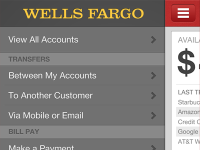
This is a self initiated project I did to redo the experience and visual design for the Wells Fargo iPhone banking app. I use it often to see what I have available and what I spent or received recently.
On this screen I am showing that you would click on the menu button to reveal your options. I love this pattern made popular by Facebook and Path - which means that the common man will be able to use this simply without confusion.
Here is a link to the original screen and one to the full size of the shot.
OLD: http://cl.ly/2q17451n0N0B092I0s2K
NEW: http://cl.ly/1O1C0X2o410x0N2C1k3C
More by David Geere View profile
Like

