Dingy Sign Graphic Style
Working on some Illustrator text Graphic Style for the next Vector Mill Crate and need wanted to get some opinions.
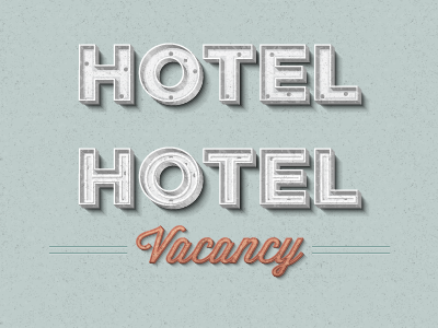
Just for some background, the new crate has a vintage mid-century modern theme going on. These graphic style are based around old neon signs. The first white "Hotel" text is supposed to be a neon sign with the neon tubes broken out and the second is has the tubes. Do you like the one with the tubes broken out? Did you even know what it was? I can just include both or just the one with the neon tubes?