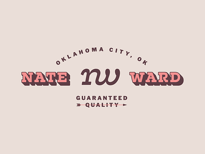
Personal Brand Update
I wanted to update my personal brand to reflect who I'm becoming as a designer. (My previous brand was done before I started design school, and now i'm finishing design school, so the change was necessary). Additionally, I have a new name and thought that would make a fun badge since it's four and four, so here we are. The arrow is of significance to me as a Choctaw American Indian. The knock and arrowhead represent the balance that I wish to maintain in my life. The knock steadies and guides the arrow, keeping it from losing momentum and falling to the ground. The arrowhead gives it the heft and aerodynamics necessary to fly through the air quickly and the sharpness to pierce obstacles that lie ahead. I wish to live my life like the arrow, ballancing tenacity and fearlessness with stability and followthrough. The weaves through the word quality, indicating an incredible amount of precision and focus, which I hope to convey in my body of work. You will also notice that I have updated my monogram to reflect this change in personal branding.

