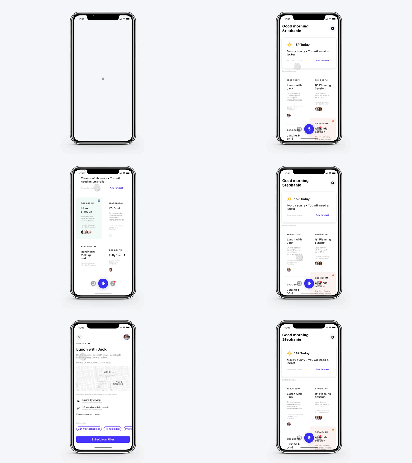
Assistant UX
Been thinking more about voice assistants and seeing how to merge in feeds and voice ux together.
This is an early test in prep for some AR work I want to explore.
Anything urgent is marked with a 🔥 emoji and in my head you can just say "show me anything urgent or on fire", it's also coloured pink.
Any event low priority and recurring is marked with a ⏬ emoji and green background.
For this project each day is segmented by a new card showing the weather for that day and will eventually become a sticky header to keep the information clean and easy to consume.
In voice I believe saying "show me what's next" could trigger a horizontally scrolling list of events taking up most of the screen with all the details and quick replies.
I chose to split the ui into 2 columns instead of full width cards, I initially tried it but felt they were too overwhelming and you couldn't really see more than 1 event at a time.
So far I've only tested this with 2 users in a cafe and this prototype seemed to have worked well.
I'm hoping to release this as a free ui kit some time early 2018.
Feedback, comments and likes appreciated!
Follow me on Instagram or Connect on LinkedIn
Psst: I'm available for hire 😎


