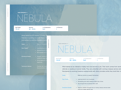
GJ - User Persona #1
I created this user persona to segment the users I am targeting with a MVP. After writing a first draft and then double-checking against a couple of potential users, I have a general direction of where I'm going.
Generally I find user personas miss the mark when they start adding pictures, identifying hobbies, and/or specifying where the fictional person lives. This adds or reinforces biases which are unnecessary. Most of that information isn't even relevant to the decision you need to make with this type of collateral.
Unfortunately if you remove all that, what you're left with is rather dry. So, I used this opportunity to test out a new art direction.
The space-motif is staying but there are multiple ways to approach it, this being one that I tried. It's too heavy-handed but I did like the font pairing (Nimbus Sans + Mr Eaves Mod).
(Note: I occasionally use collateral like this to test out new styles because it saves me time from trying out a direction on a larger piece later on.)
Ask me questions in the comments if you have any.


