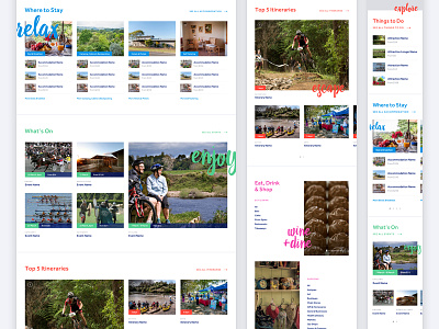
Cambridge directory section grids & colours
A while back I worked with Bronte and Cambridge Tourism to conceptualise and design a new Cambridge tourism website. I was responsible for UX & UI design.
The site offers a directory of accommodation, events, activities, restaurants, and retailers in the area.
We used a variety of grids, colour-coded sections, and unique type elements to help differentiate the different listing types.
Larger versions attached.
----
Need a design partner for your next big project? Contact me at benek.nz
Follow me | Website | Behance | Pinterest | LinkedIn | Twitter
More by Benek Lisefski View profile
Like


