Innovative Eye Pillow Landing Page Design
Hey fellas!
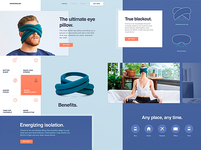
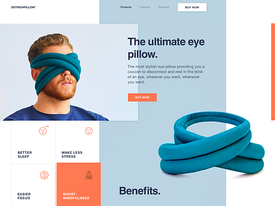
Remember the Eye Pillow shot we posted sharing some parts of the product landing page? Well, now we’re excited to share the entire page created here, at Zajno, for a cool company that designs and produces pretty unusual pillows.
Join our Newsletter for more goodies!
Goals
Creating a website dedicated to the company’s new, revolutionary product - Eye Pillow, showcasing all the benefits and advantages of this innovation. The website should match the product’s originality and speak to the target audience.
Approach
We kept on experimenting with the layout and composition to find some non-trivial solutions that would showcase the product’s rad nature in the best way. To this end, we chose to use demi bold typography together with geometric layout ’cause, in our opinion, it’s the best match to the concept.
Results
We ended up with a lively and unconventional website design that adheres to the product’s style and originality and speaks to the target audience. Would love to know what you think of this. Stay tuned and share your ideas!
Press "L" to show some love!
ᗈ Join our Newsletter!
ᗈ Website
ᗈ TheGrid
ᗈ Spotify
ᗈ Twitter
ᗈ Medium
ᗈ Facebook
ᗈ Instagram


