#013 Direct Messaging
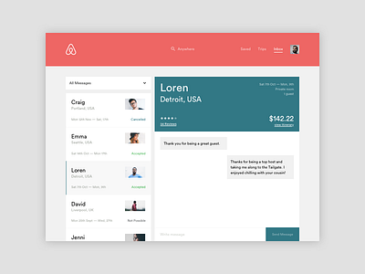
For today challenge I wanted to redesign Airbnb's message dashboard (on desktop). I find the existing solution frustrating for two main reasons.
Reason 1
Opening a single conversation navigates the user to a new page which results in them going back and forth to see other conversations. To address this issue I placed all conversations in a side rail as seen in many other messaging apps.
Reason 2
The summary itinerary within a single conversation takes up a lot of space. This isn't something I want to see every time I send a host a message. I feel this could be condensed to just the key information and the user has the option to expand if wish to see more.
I also had a little play at tweaking the existing UI too!
🤔 & ❤️ welcome
More by Asis Patel View profile
Like


