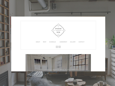
Studio 1918 Website & Logo
After we just launched the new website for LaBuervenich Photography, the owner decided to create a second website to rent out their studio! We were happy to accept and build a beautiful minimal website for renters to sign up, view calendars, reserve times, and sign contracts in one space.
She also needed us to design a logo and come up with a name for her studio. We did some research and found out what year the studio was built, 1918, and we immediately loved the name Studio 1918. We went with a grey lined style logo to go with the minimal site and it blended together perfectly!
If you ever need a space in SLC, this is the place to go!
View it at: http://studio1918.com
Follow me elsewhere 👇
https://instagram.com/zacherynielson
https://twitter.com/zacherynielson
https://youtube.com/zacherynielson


