Reimagining the Nominees Section of Grammy Awards Website

Hey there!
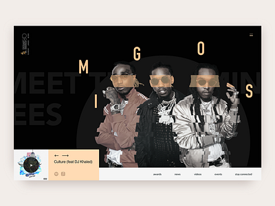
Here, at Zajno, we believe the more you experiment, the sooner you’ll find your own way in design. That’s why today we wanna share our take at Grammy Awards website. What you see above is a nominees page in the “Best Rap Album” category.
Goals
Reimagining the way nominees are shown in each category by creating a dedicated page for each nominee.
Approach
We thought it would be a great idea if all nominees had their own pages where a user could learn more about them and even listen to their music. So we created a page where you can see Migos - nominees in the category “Best Rap Album” - and you can listen to their album “Culture” on Spotify and Apple Music by following the links we attached. Looking for the ways to step up the design game, we decided to use geometric patterns and parallax scrolling that would be animated when a user navigates among nominees. We used bold typography to put accents on the main elements.
Results
We reimagined how the nominees part of Grammy Awards website would work, so that the nominees are presented in a “cooler” way.
What do you think?
Don’t forget to follow Zajno on social media and feel free to drop us a line:
Website | TheGrid | Twitter | Instagram | Medium