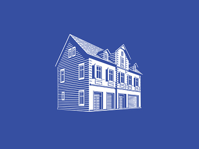
Kern Bakery house logo
This is one of the additional branding elements I have designed for the Kern Bakery branding. It is a family business that started over 60 years ago and this is the original form of the house, where the bakery started and still has its headquarters.
Because we ditched the crown that was part of the logo before we redesigned it (http://im.hzm.at/data/12401/logo1.jpg), we wanted to add an element that communicates their down-to-earth nature and tradition. A lot of the clients are old people and even though we gradually want to make the brand more contemporary and open towards younger audiences, it needs to be done in a sensitive way that doesn't scare the elderly. So adding a traditional element gives us more flexibilty with the way we work with typography. It is usually applied small, further away from the main logotype.
