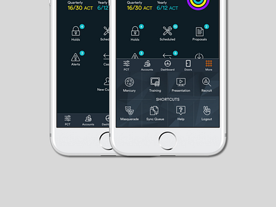
Neo Navigation
We decided to organize the menu in a bottom tab bar. The previous product was only designed for iPad and the menu wasn't usable when users downloaded the app on iPhone. This feature was lead by Ben Hunt, a senior UX designer on my team.
More by Mack Culp View profile
Like
