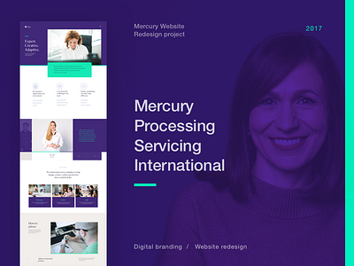
Mercury Website Redesign—Behance Case
Hi all,
Few months ago we have successfully launched Mercury website. It was a huge website redesign and rebranding project.
It was a big website redesign and rebranding project.
The first discovery workshop was done in January, and we've come a long way since then. It was a great collaboration between the client and different @Degordian teams.
We did: User Experience, Visual communication together with the digital branding, illustration, photoshoots, video production, animation, copyrighting, seo, UI design, front-end, backend development, and more...
I managed to find the time to do a Behance case study, where we show some behind the scenes.Also we try to present a small part of the the project process.
Be sure to check the whole case study on Behance —›
___________
We are available for new projects and we are open for partnership collaborations!
Contact us ›

