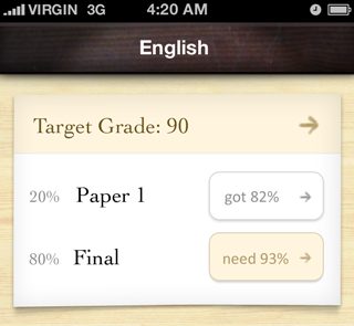
Grades 2 Sneak Peek - full
A zoomed out view of my last shot. May give you a better idea. Verbatim description from the last one:
I'm going for some very distinct visual differences from Grades 1 ( http://gradesapp.com ) in order to accentuate the "newness" of this point upgrade.
I am maintaining the drawer/wood/paper metaphor but using different colors and textures. Lighter, less noisy primary background.
The header wood texture is actually based on a picture my brother took with his camera of some nice wood here at the house.
More screens on the way.
BTW: this is an early iteration so looking for brutally honest input.
More by Jeremy Olson View profile
Like
